Create Your First Project
Start adding your projects to your portfolio. Click on "Manage Projects" to get started
Vi An Nam Packaging Design
Vi An Nam Packaging Design Overview
Vi An Nam's packaging design is a direct reflection of the Brand Guideline style: refined, culturally rich, and consistent.
1. Color Consistency
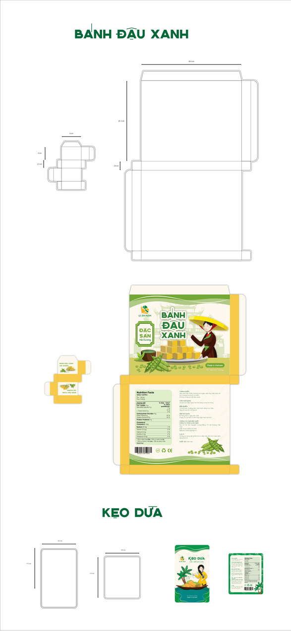
- Main Colors: The packaging consistently uses a combination of Green (for large boxes and shopping bags) and Yellow/Orange (for smaller boxes like Mung Bean Cake). These colors create a fresh feeling while keeping the warmth and tradition.
- Logo and Patterns: The logo and the brand's signature triangular patterns are printed subtly on paper bags and packaging surfaces, ensuring high brand recognition.
2. Variety by Product Line
Retail Packaging:
- Mung Bean Cake/Green Rice Cake (Bánh Cốm): Usually uses rectangular paper boxes with bright colors. They are visual, making it easy to see the product name and brand.
- Paper Bags: Shopping bags are clean white with green handles, focusing on minimalism and elegance.
Gift Packaging (Gift Set):
- For gift sets (for example: Sesame Candy gift box), the design uses a bold Red color combined with character illustrations. This aims to increase the festive and formal feel and highlight the gift's value.
3. Usability and Aesthetics
- Structural Design: The packaging is designed with a sturdy box structure that is easy to fold and open (for example: the Sesame Candy box designs).
- Aesthetics: Overall, the packaging design is highly artistic. It uses simplified illustrations and artistic fonts, turning the packaging into an effective communication tool for the brand story.


