Create Your First Project
Start adding your projects to your portfolio. Click on "Manage Projects" to get started
Vi An Nam Brand Guideline Design
Vi An Nam Brand Guideline Design Description
Vi An Nam's Brand Guideline document is created to ensure a consistent and professional brand identity across all platforms.
1. Colors and Visual Style
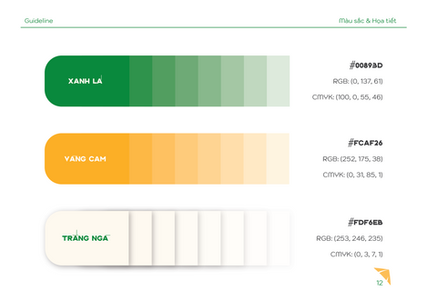
- Core Color Palette: Focuses on the combination of Green (symbolizing nature and fresh ingredients) and Yellow/Earthy Orange (representing tradition and the warmth of agricultural products).
- Patterns and Layout: Uses patterns, triangular shapes, and diagonal color blocks to create a dynamic and modern visual layout.
2. Logo and Font Standards
- Logo and Proportions: Detailed rules for the grid system, safe zones, and color versions (negative/positive) to ensure the logo always displays accurately and clearly.
- Typography: Defines official fonts and usage rules for text levels (Big Headlines, Headings, Content) to maintain consistency in communication.
3. Practical Application
- The Guideline provides clear instructions on how to apply design elements across various applications, from product packaging and media publications to office items.
In short, this Brand Guideline is a solid design framework that helps Vi An Nam maintain its brand identity consistently and professionally.


